Mobile app that helps to rescue surplus food not sold by groceries
Project description
My role:
On this project i was working as
UX designer, UX researcher, UX writer
Duration:
Project done over 2 weeks in March 2022
Responsibilities:
User research Interviews and Competitive analysis Wireframing UI design Prototyping User Testing
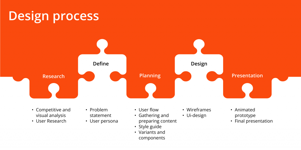
About project
42%
According to the European Commission, 42% of all food produced in Europe is wasted during final consumption, also 2/3 of this amount of food thrown away could have been avoided.
Сonsumers can contribute to minimising food waste by changing their habits. However, the issue of food waste cannot be solved solely at the consumer level.
In Austria today there are organizations fighting against food waste in various ways.
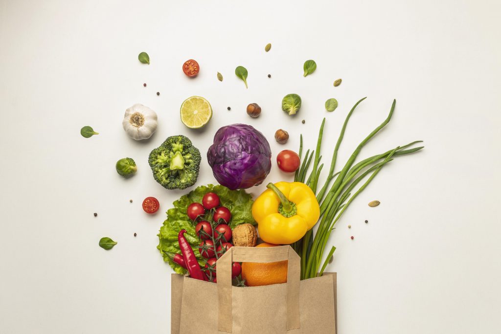
Considering all of the above I created a concept of a mobile application that helps to save food surpluses that are not sold by grocery stores. A buyer purchases a surprise package with unsold food for a donation, thus contributing to the fight against food waste.
The problem
Nowadays the global problem of wasting edible food is attracting a lot of attention. In addition to government regulation, large chain stores are also trying to reduce food waste.
But ordinary people may not know about such promotions or the process of obtaining discount products is unknown
The goal
Design an mobile application that will work with one of the well-known organizations in Vienna, which is engaged in the transfer of grocery products that large chain stores have withdrawn from sale.
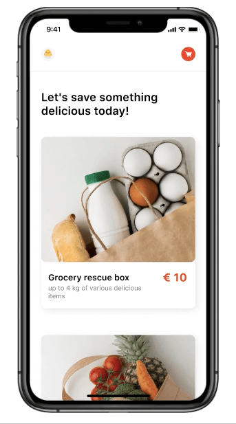
In the mobile application, the user will see information about products, what is included in the boxes. There is a option to buy boxes and pick up from the shop nearby.
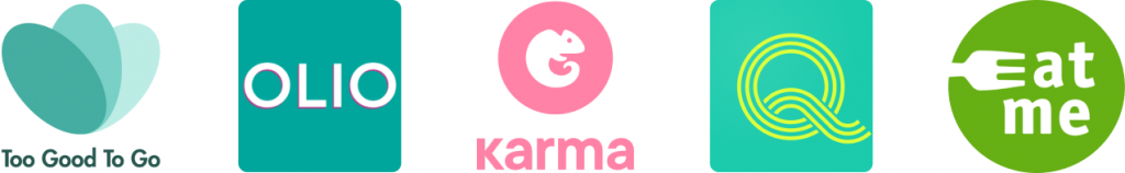
Competitive analysis
I started with a competitive analysis and analyzed 5 applications
I researched the user experience of the TooGoodToGo app.
There is a TooGoodToGo Wien group on Facebook where users share information and photos of their in-app purchases.
Interview
I created an interview guide and did a semi-structured informal interview with my target group. The meeting was arranged personally and the interview took around 30 minutes for each.
The interview was very helpful for empathising with my target users and helped me to realize the problem and their needs feelings and thoughts better.
Pain points
Evaluating of collected data led to the identification of users pain points.
I figured out 5 needs. However, in this case study, I decided to consider 3 of them main pain points.
Frustrated that expectations were not met
The contents of the package do not satisfy taste preferences
The price of the package does not match its contents
Fear of stale or undercooked food
Negative experience dominates over positive intention to help
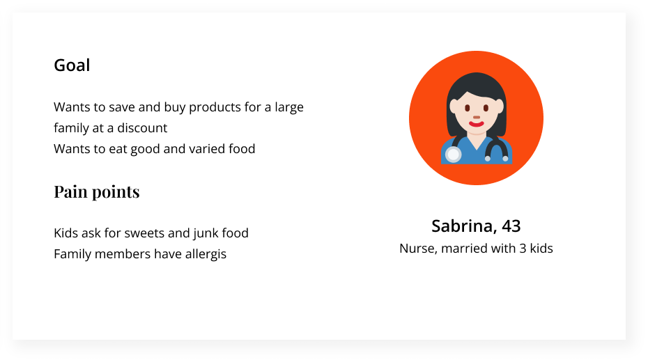
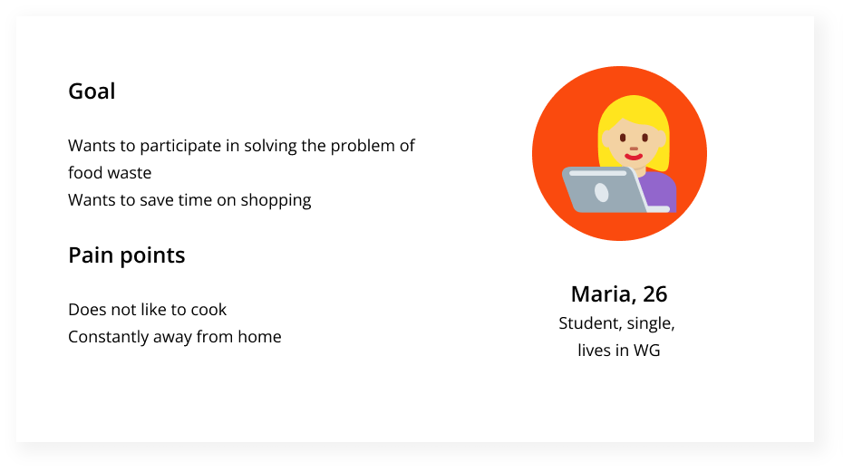
User personas
Using the results from the user research, I created the user personas below to design the app in terms of usability and empathy, gearing towards a user-centered process.
User Flow
I started the planning phase by creating a user flow in Miro.
I designed user flow with easy and understandable navigation between the screens with less cognitive load.
Low-fidelity prototype
After gathering multiple insights, brainstorming, and prioritizing ideas together, I created the low-fidelity wireframes on Figma.
Usability studies
In the next stage, I did a usability testing of the low-fidelity prototype that helped me uncover opportunities to improve the overall user experience by building an user-friendly experience.
I conducted a usability test with five users. Participants were able to use the app easily. There were just small iterations.
Emoji icons in filters
Emoji icons aren’t contrast and to difficult to evaluate on the face of it
Search
There is no need for searching field
Menu
Menu included only user profile and settings
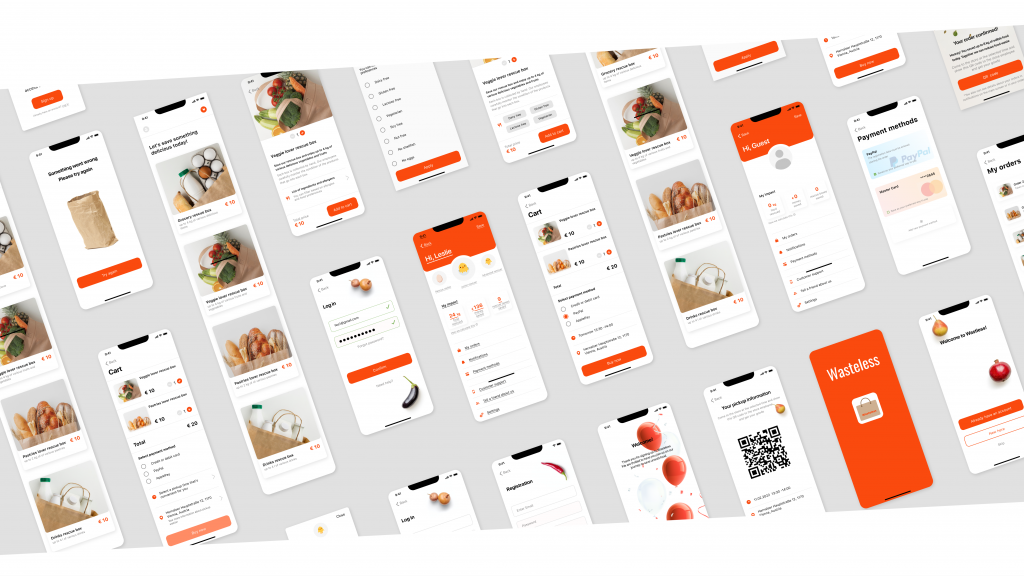
Mockup
After evaluating the user’s feedback, I came up with follow recommendations. And then I modified the low fidelity wireframes according to recommendations.
Instead of emoji icons that were not clear in the screen, I left only inscriptions to help the user better understand what to choose
Most of the participants were confused by the search field (App provides rescue boxes with food surpluses) and filters, because users can use specified filters on the product screens.
Also I replaced hamburger menu to profile icon.
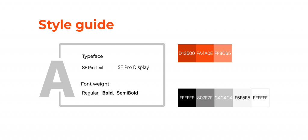
Style guide
My next steps before creating Hi-fidelity prototype were collecting references, creating moodboard and style guide, that consist of color palette, typeface, style and icon set.
Start
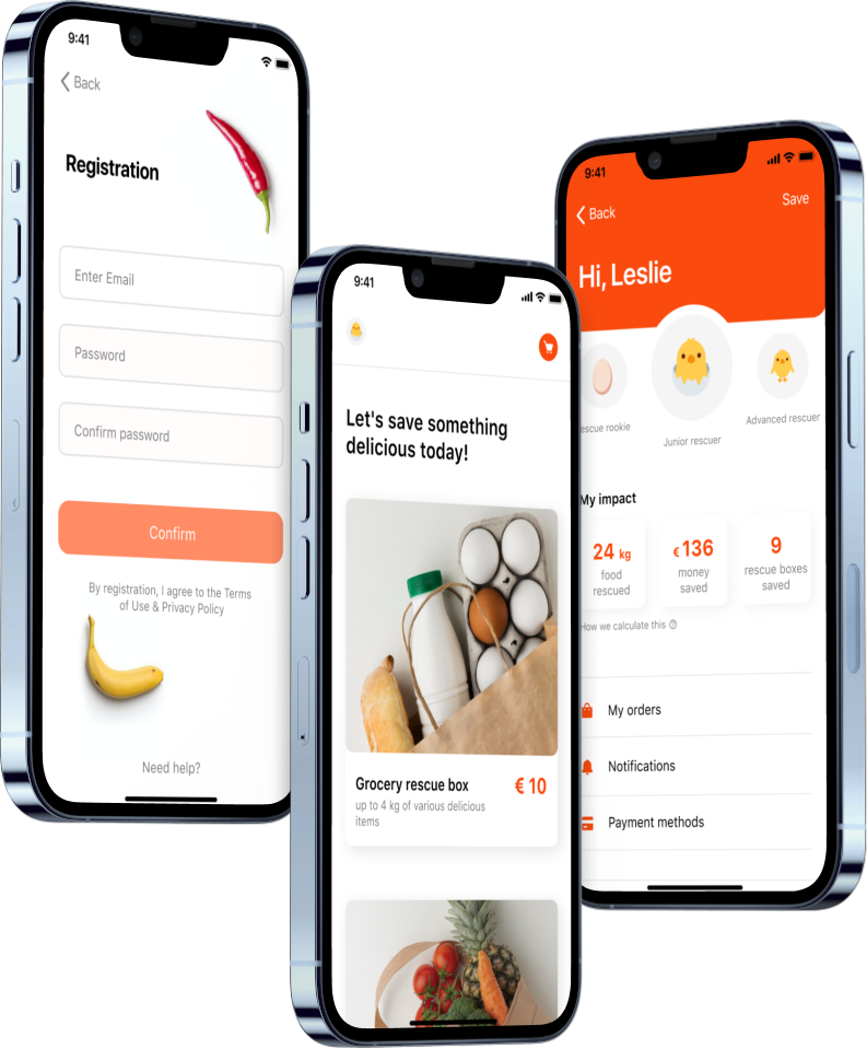
At the onboarding the user can choose to register or start using the application without registration, getting to the main screen
Onboarding
After registration the user will have access to advanced features such as order tracking, statistics with the ability to track how many kilo of food and how much money was saved.
Also, the user can upgrade his status from a beginner to a profi.
Main screen
The main screen consists of product cards, a profile icon and a shopping cart.
Clicking on a product opens a product card, where the user can also filter allergens and preferences
Check out
During the order confirmation process, the user can choose the payment method and convenient time and place for pickup
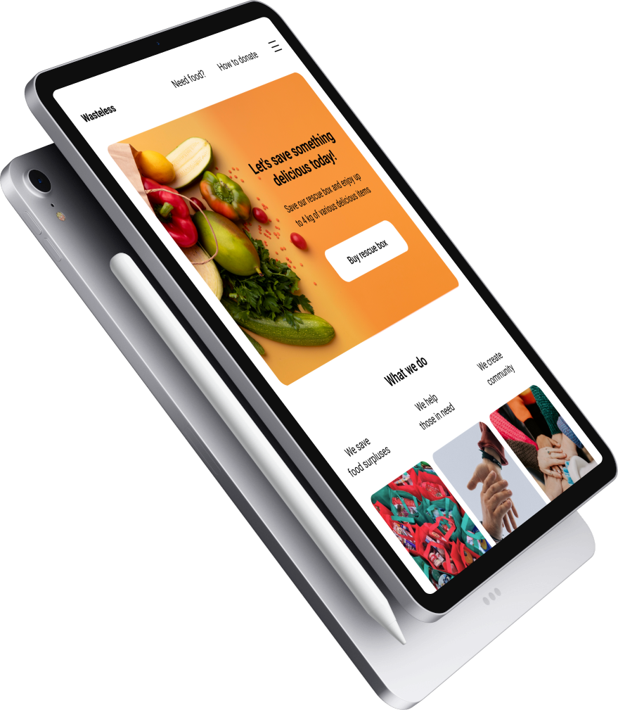
The design for screen size variation include mobile, tablet and desktop.
I optimized the design to fit specific users needs of each device and screen size.
What I learned
From this project I learned that designing a product is not just about creating the best look of the product. It’s also about the user’s good experience that I as designer can create.
Thinking, that designer has to always put the user’s thoughts and feelings in the center, helps to create the best user experience.
Designer needs to understand users by empathizing and doing some research to know what they really need, what are their pain points, so that can help to create solutions to improve the good experiences for the users.
The best product is the product that is easy to use, equitable, useful, and enjoyable.
You might also like
Vierbeiner
veterinary clinic APP
Mobile application to help people to easier schedule an appointment to veterinarian